the ideal public restroom
The primary goal in using any public restroom is of course to relieve oneself. However, this goal only barely edges out a second and a third, which are to accomplish #1 while (2) touching as little as possible and (3) avoiding interaction with other visitors. I take these goals as self-evident, and consider them to be easily and inexpensively achieveable. However, based on wide-ranging experience, the restroom architects of the world (and of the US in particular) appear to be unaware of them or at least unaware of basic design principles they dictate. In hopes of correcting this I offer this checklist of features of the ideal public restroom:
-
The door to the restroom should open outward. This allows a person to exit the restroom after hand-washing without contaminating his or her hands on a door handle touched by people who don’t practice hand-washing. A kick plate on the bottom of the door, or a knee-high electronic switch near it, allows it to be opened with your foot. An acceptable alternative is to have a winding passage instead of a door (airport-style), provided it is wide enough to accommodate two-way traffic and wheel chairs. If the exit door must open inward, there is no reason not to install a toe grab or (as I’ve seen in McDonald’s) an arm hook that can be grabbed with one’s elbow. If all else fails, a waste basket should be placed next to the door, such that visitors can use a piece of paper towel to open the door and then toss it into the basket.
-
In men’s bathrooms, first build two stalls. If there is more room, add a urinal, then another. Continue on, alternating between adding a stall and then two urinals.
-
Toilets should be flushed by foot. This is what sensible people do anyway. The lever should be easily cleaned.
-
There should be a place to secure a small child, both for purposes of changing the child, and of having a place to set the child while the adult gets their own job done. This includes the men’s bathroom!
-
The purpose of stalls is to provide privacy. It is a madness therefore to have stalls that are 5’10” tall, which seeems to be a common practice, at least in America. Stall walls should be no shorter than 6’6” tall, and should start at roughly 1’ off the ground. There should be no visible gap in the door once it is closed.
Urinals need dividers, too. Contrary to what seems to be common practice, the purpose of a divider is to break visual contact between adjacent visitors. They should therefore be at least 6’6” tall, just like stalls, and should start maybe 2’ off the floor. (If the budget is tight, a divider from shoulder to head level is preferable.)
-
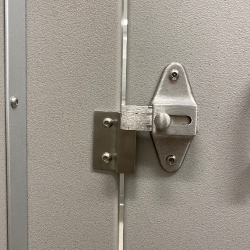
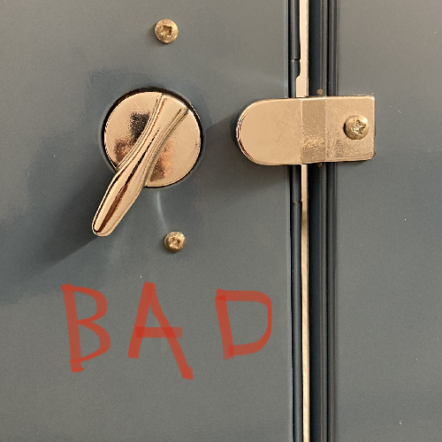
Stall doors should lock securely. The lock should be designed such that the locking mechanism works in the direction of gravity and will therefore fail gracefully should the latch internals break down. A falling deadbolt is ideal. Doors should open in so that if a person forgets to lock the door, they can reflexively block the door opening even while engaged in getting the job done.


-
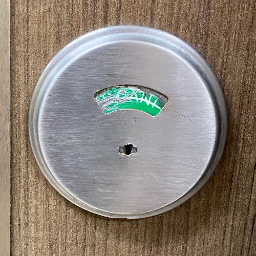
There should be an obvious external indicator that notes whether a stall is in use. This indicator is engaged when the visitor locks the stall.

-
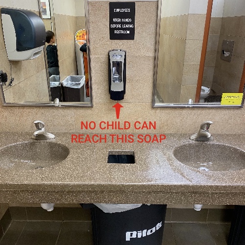
Sinks should be both child- and wheelchair-accessible. For children, this means either a very low sink or a stepstool, and soap dispensers that are within reach.

-
The faucet should be controlled automatically via a reliable sensor or, ideally, via an easily-cleanable foot lever.
-
Soap should also be touchlessly distributed and should not be scented (though almond is okay).
-
No hand dryers. They are oppressively loud, they spread disease, and they don’t do the job. This especially applies to Dyson’s latest abomination which installs over the sink, thus blowing the day’s accumulation of filthy gray water from the sink all over everything. Only automatically-dispensed, rough, unbleached paper towel should be distributed.
Additionally, there should be something interesting to look at. Advertising is tolerable. Do not under any circumstances put a mirror in front of a seated toilet. A thoughtful modern approach is a polite sign asking people to put away their phones, particularly if there is a shortage of stalls (see rule #2).